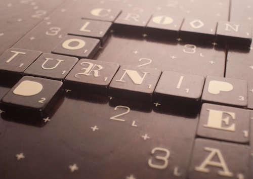
I like Scrabble, I like the Oxford comma, and I like typography. So why does the a new Scrabble set for Typographers (or at least people who like type) have me so out of sorts? For those not hep enough to know, Typographer’s Scrabble is a redesigned Scrabble set getting some design blog love these days. It’s got several great features and one terrible flaw that just plain ruins it for me.
The Typography Edition has a lot going for it that has nothing to do with typography, and honestly, not a lot to do with Scrabble either. It comes in a birch-covered walnut box and the game board is made up of six magnetically-attached cork-bottomed sections. This is winning major points with me on materials – wood and especially cork are favorites. The board itself is nice enough but I’m a little worried that the treatment of the grid and the double/triple score spots is a little too low-key and therefore harder to read and use than the orthodox version. But I’m ok with all of that.
What I’m not ok with is the “typography” part. It’s not clear to me if each of the 98 letter tiles is printed in a different font or if there’s a smaller number of fonts distributed across the letters. I can see that at least some letters come in different fonts. What we have here is not typography, it’s ransom note.

Bear in mind that anybody trying to “do” typography on a Scrabble board has an uphill battle. Typography is not just letterforms, it’s the way letterforms work together in words and paragraphs. In Scrabble, you have no paragraphs or even sentences. You have only words, and only capital letters. The spacing between letters is defined by the grid of the board, which rules out ligatures and leads to some pretty awful keming. About half of all Scrabble plays go vertically, and hardly any fonts look good doing that. All of those characteristics of the Scrabble game board are pretty much barriers to good typography.
Does that mean you shouldn’t try? Certainly not. In fact, in what I believe to be the origin of this idea, designer Andrew Clifford Capener proposes that you could buy his Scrabble set with the font of your choice or that you might even buy additional font packs. I think that would be a much better idea than this ransom note nonsense. Unfortunately the edition being marketed for pre-ordering now has only the ransom note available.
So, if I ran the zoo what I would do here? Well, as I’ve outlined above it might be a fool’s errand to do typography in the confines of a Scrabble board. But if this blog isn’t about foolish quests, what is it about? With that in mind, I have two semi-contradictory ideas for better Scrabble typography:
1. lowercase it. I like lowercase letters for the legibility. I DO NOT MUCH LIKE UPPERCASE IN GREAT QUANTITY. [On a total tangent, if you visit the grave of e e cummings at the Forest Hills Cemetery you’ll learn his full name and see that his family didn’t much care for the lowercasing.] Since Scrabble word plays exist in a vacuum outside of sentences, who’s to say they should be capitalized or not? I realize there are practical problems with the varying heights and ascenders/descenders in the lowercase world but it might be interesting to try lowercase, it certainly would be fresh and different.
2. Choose the right font for the job. As in any design project you need to pick what works, not your pet concept or what you think will win you an award. Redesigning a Scrabble board includes making a playable game. Given the constraints of the board and how the game is played, I’d probably go as close to a monospaced font as possible although maybe not all the way. (Designer Capener’s nice minimal website is done in Courier, a bold choice for a website if you ask me, but a fine candidate for a Scrabble set.) Maybe something with a slab serif. Ideally the font would fill the almost square Scrabble tile well to reduce the uneven letter spacing, and work passably in vertical play. Poster Bodoni could be a fun choice.
Will I pre-order typography scrabble for $200? As of now, there’s only 39 sets left out of 1,200. Would I pay $200 for a set that addressed my issues above? I’m thinking probably not, since I already own three scrabble sets that I don’t use enough. Perhaps I’d buy a new set of typographically enhanced tiles for a lot less money. In any case, I hope that board game makers will pay attention to the possibilities raised here for better design and better materials in game boards.
