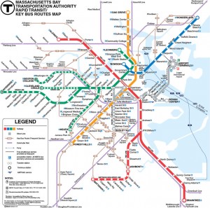
 Staring at the MBTA map and letting my mind wander while waiting for the train, I noticed a repeated pattern of 4/5.
There were five Green line branches, but only four survive today with the obvious gap at the start of the sequence B, C, D, E. I guess if the E line had been cut, it wouldn’t have been so obvious. OK, the E line has been cut back, but not cut out.
More recently, there were five terminals at Logan, but Terminal D was absorbed into C and E in 2006 leaving A, B, C, E. It was decided that renaming Terminal E to Terminal D overnight to close the gap would cause too much confusion.
Also in more recent memory, the Silver Line now has only four line but numbering for five. It acquired a gap with the demise of the SL3 in 2008 and the appearance of SL4 and the renaming of the SL5 in 2009 making the list of Silver Lines a gappy SL1, SL2, SL4, SL5. The fact that the Silver Line still exists as two unconnected parts (SL1/SL2 and SL4/SL5) makes it a little less odd that there’s a gap in numbering. Although there were never five Silver Line routes in operation at the same time, we still have the 4/5 gap in numbering.
You can witness the changes of the Green and Silver lines in Andrew Lynch’s estimable Animated History of the MBTA, with a hearty hat tip to Universal Hub. If you squint real hard at the airport loop in the last two slides you might or might not see the end of Terminal D.
What’s going on here? Do the planners have spooky Mickey Mouse hands? Does Boston overbuild then scale back? Shrinkage? I have no idea, I’m probably just making connections because there’s no bubble wrap to keep me busy while I wait for the T. In any case, it’s interesting to think of the transit system as organic and changing, even if that means both growth and decay.
For extra credit, check out Cameron Booth’s upgrade to the official MBTA map.

I think it’s simply a more amazing pile-up of coincidences rather than an actual shrinkage of transportation infrastructure.
The A Line was dispatched at the time largely because of the limited availability of trolley rolling stock. That (along with the lobbying of Goodyear and other companies) led to its replacement originally with a trackless trolly (bus with overheads, as you still see in Cambridge), and eventually a regular bus, which still runs today. The mode had changed, but the route still exists. Although I prefer trolleys over trackless trolleys over buses, I can’t argue that any is more efficient in getting people from point A to B. I ride buses all the time and prefer the experience greatly over the B Line!
Terminal D, as you mentioned, was incorporated, so really that’s just about a naming convention.
I’m not as familiar with the Silver line, so I can’t really speak to it, but I do know that it was rolled out during the period in which I lived out of state, when they were realigning the Orange Line and trying to replace its service and that one reason “Select Bus Service” (although a horrible implementation of that concept) was selected was its flexibility. They could be experimental with the routes. It’s no surprise that they have evolved. It’s hard to lament the loss of a service that has been around for less than 15 years.
If anything, I think these things all illustrate a particular, and interesting, flexibility of thinking and an interesting perspective on absorbing history. Bostonians are apparently very willing to let old naming conventions stand, even in the face of change.