by David | Mar 18, 2015 | design
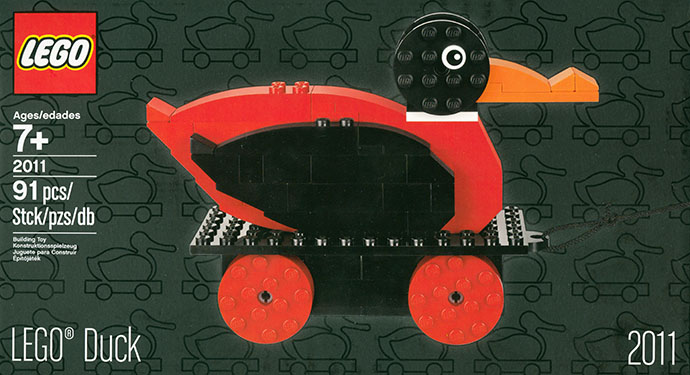
It rolls for thee. Did you know that the first LEGO toy, made in 1935, was made of wood, not plastic? Did you know it was not composed of wooden bricks but a single assembled piece? Did you know it was a duck? On wheels? It’s a fact. These days, the original...
by David | Feb 20, 2015 | design
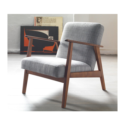
Despite what you may have heard, I do not spend all of my time following IKEA’s every move and hacking their furniture into cat habitats. But I do enjoy good design at prices that are actually within my reach, so I was bummed to have missed the limited-edition...

by David | Feb 6, 2015 | design, eating, technology
It’s been some time since we’ve had a kitchen technology update, not since the the two-port usb kitchen, in fact. So pull up a chair and I’ll tell you more than you wanted to know about how I installed a dedicated kitchen tablet. Every now and again,...
by David | Jan 2, 2015 | culture, design
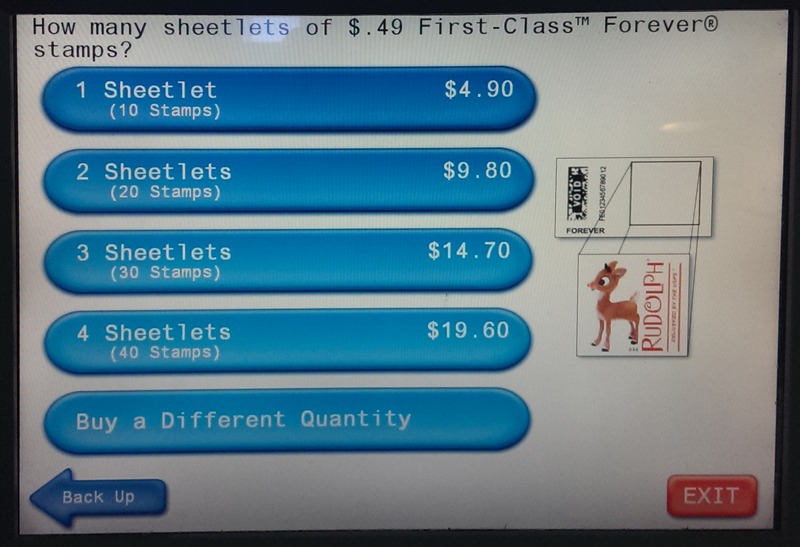
I got to the post office early to buy stamps. I knew the windows would be closed but was planning to buy stamps from the machine. A week after Christmas, here were my options: How many Christmas stamps would you like? Zero is how many I would like. No other options,...
by David | Jan 1, 2015 | design
Resolving to meet 2015 with beginner’s mind.
by David | Oct 8, 2014 | design, economics, media, photo
This summer, I was fortunate enough to have the opportunity to teach a business basics class for a group of artists participating in a new way to create and sell artwork, Community Supported Arts. Like its inspiration, Community Supported Agriculture (CSA), CSArts is...